Overnights EP

Album Concept Art

Album Concept Art

From writing to recording to release, Minshara's Overnights is one EP that should not exist. What was intended as a month-long sprint turned into a multiyear marathon marked by late nights, lineup changes, and lost work that challenged the band's commitment and tested their resolve. Immediately apparent, the bright tones and blissful melodies of the opening track are in stark contrast to a visual identity of typographic glitches and digital scars that reflect the project's turbulent path. Persistence and repetition force legibility despite missing characters and mixed orientations; but one metaphor truly defines the message. Among the chaos a single tree is set ablaze, an intense event that, while stripping the perennial of its seasonal cover, hardens its shell and preserves its core, igniting a canopy with the renewed energy needed to push on.

〉 Superstition

Koji Says Aloha

Tour Merch

Tour Merch

Koji is an American songwriter, artist, and activist with DIY roots and a discography spanning nearly two decades. His debut full-length, Crooked in My Mind, blends honest vocals, thoughtful melodies, and driving rhythms that showcase experiences gained from countless miles spent on the road as a touring musician. This Polo Sport inspired classic is a limited run collaboration in support of the record's release that reflects a genuine appreciation for the natural beauty of the US and recognizes its role in his craft. Simplified details of the original patch design produce sharper prints with the added flexibility to offer alternate colorways on future tours. Following punk's PMA (Positive Mental Attitude) philosophy Koji uses his music as a platform to spread messages of unity and compassion, so it's necessary the visuals do too.

〉 Crooked in My Mind

Minshara Music

Kick Drum Head

Kick Drum Head

Overgrown

Overgrown

Great band logos are sacred, linking music to its listeners and listeners to each other. These are personal symbols worn with pride and broadcast as membership to an exclusive club, often times etched into skin as evidence of a lifelong pact with the band. Imperfect yet timeless, the best ones capture a feeling, define the moment, and speak to the heart and soul of a movement. The ambition for Minshara is no different, a visceral reaction to the music and an expression of their high-energy live performances embodied in a design for everything from show flyers and album covers to merchandise and social media campaigns. While a unique name benefits from a lack of brand confusion, its unfamiliarity requires extra effort to solidify its spot in the cultural lexicon. A syllabic breakdown provides the necessary mnemonic introduction and its compact form creates a distinct visual icon that pops regardless of context. In more ways than one Minshara intends to set themselves apart from the clichés of the genre, betting that once their sound hits your ears their name will never leave your head.

Into The Night

518 Office Park

Standoff Lettering

Standoff Lettering

Cutout

Cutout

Mimicking strip windows and bold forms typical of the suburban office park, the address becomes the brand. Simple moves transform Century Gothic Bold, a popular and accessible geometric sans-serif standard on all Windows PCs, into a modern logotype that both reflects its surroundings and defines its own identity. Horizontal banding reduces the scale of the letterforms making them more approachable while an angled baseline introduces forward movement and upward growth, tying everything together. The refreshed silhouette provides opportunities for multicolored expressions, dimensional extrusions, and layered cutouts that feel familiar in their context. One challenge with augmenting legibility, in this case, is choosing how much to remove without losing the parallel function of address and logo from the perspective of a driver passing by at speed or one caught in the chaos of rush hour.

Office Space

Mainline Excavating

Equipment Decal

Equipment Decal

Type Mask

Type Mask

Cut and fill, it’s the process of excavation to balance a site by removing material from high points to infill low points until the desired grade is reached. The creative challenge is getting there using the dirt on hand, nothing trucked in or shipped out. This concept forms a strategy to rebrand Mainline Excavating, Inc. from a crew of construction workers with big shovels to a team of experienced engineers with smart solutions. Aside from letterheads and uniforms, the brand’s primary exposure is from a distance on work trucks and heavy machinery. A simple font and distinct composition do most of the heavy lifting, providing a strong silhouette capable of withstanding the wear and tear of a construction site. Conceptually a single mound of dirt is ‘excavated’ from the word itself landing inline as a natural extension of the typeface and leaving behind evidence of the process, while a series of up and down arrows are hidden within the negative space recalling the transformation of a landscape as it’s sculpted into submission by an army of excavators. The result is not a logo but a language of typographic elements that embody the means and methods of a trade with the power and flexibility to become the icon of an industry.

Cut & Fill

All Day Ride

Vinyl Die Cuts

Vinyl Die Cuts

Dimensional

Dimensional

Pitched as a private rideshare service for executives working in Center City Philadelphia, All Day Ride is Uber before Uber. For the meeting-hopping CEO or bootstrapped startup entrepreneur time wasted is money spent, and nothing is more expensive than navigating an asphalt maze in hopes of winning a game of parking roulette. William Penn’s 17th-century urban utopia saw Philadelphia as a grid of streets defined by a central hub surrounded by four public squares. Although he didn’t account for the confusion of bike paths, turning lanes, and other street markings, a combination of past ideas and present conditions merge to form the heart of this brand. Cascading font weights highlight ‘Ride’ as the primary service, sending the word along a path that wraps the text like a taxi circling the newest city square before continuing on to its destination. Stylized car wraps, window decals, and vinyl stickers slapped on lamp posts pop against the backdrop of a busy streetscape. And while the concept of a personal chauffeur is nothing new, the idea to share-a-chauffeur is and ADR is set to be the de facto standard.

〉 The Pitch

Travel Simplicity

Passport Stamp

Passport Stamp

Illustration

Illustration

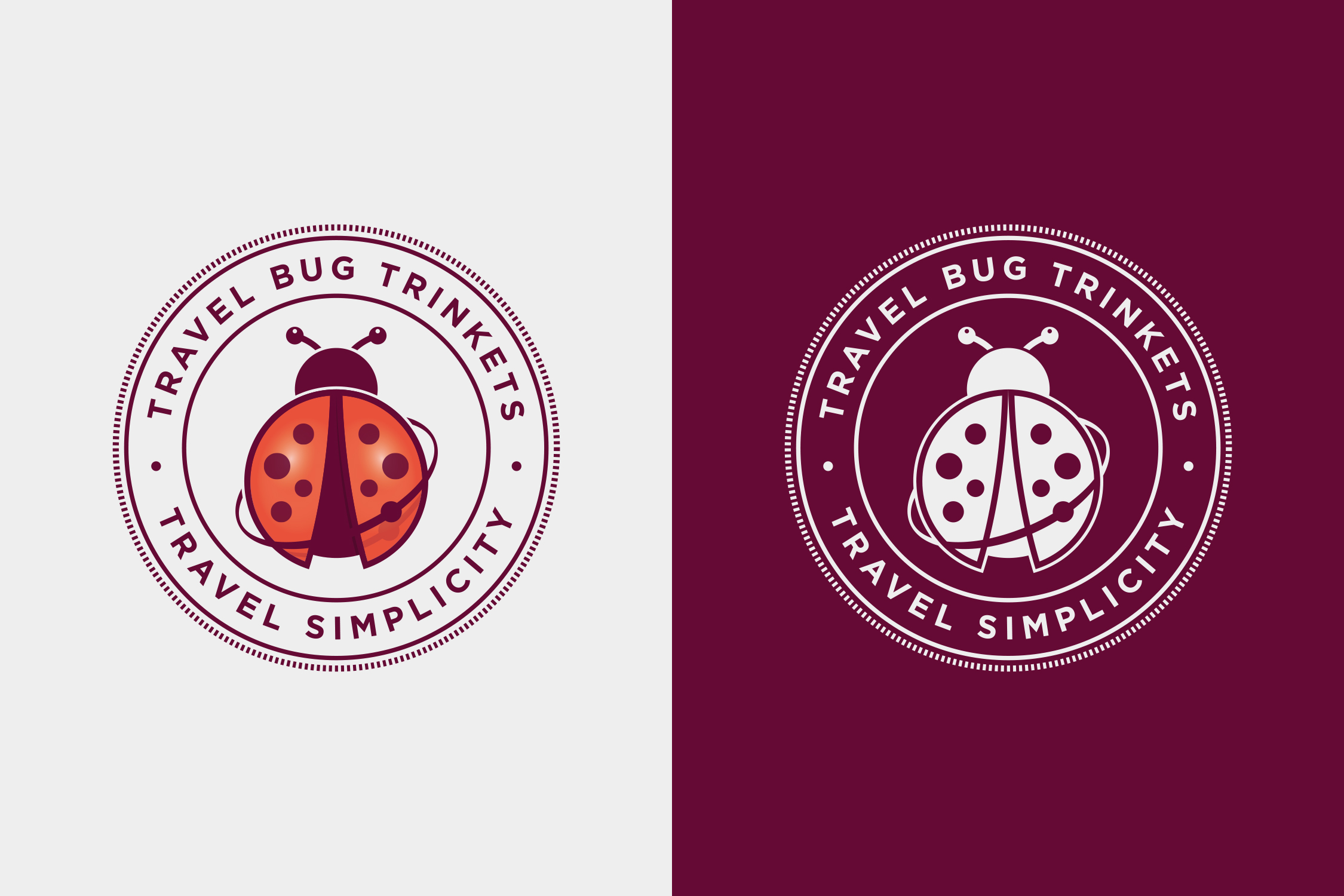
For the world traveler, nothing is more satisfying than a stamp-filled passport showcasing all the stops made along the way. From country to country, town to town, these government-sanctioned illustrations grant an official right of passage to new cultures and exotic locales. Whether planning their first trip or checking another item off the bucket list, Travel Simplicity provides the white glove service to help each client achieve their goal of becoming a globetrotting expert. And since nothing says pro like a well-prepared passenger, they offer the products and accessories to do just this. The Travel Bug, a token of good luck and symbol of protection, is their graphic guarantee promising an all-access pass to a safe, anxiety-free adventure. Spots dot its back like pins on a map, remote islands in a vast sea of possibilities ready to be explored and stored as treasured memories. Its friendly appearance and warm tones are a welcome reminder that with Travel Simplicity no one goes alone.

Guidebook

Ron Lexicon

Wax Seal

Wax Seal

Bevel

Bevel

Representing the Keystone State, Ron Lexicon is a Harrisburg-based lyricist, studio musician, and all-around beatmaster delivering explosive rhymes with old-school style. His rock roots and drum heavy productions are reminiscent of golden age hip-hop legends Beastie Boys, Run-DMC, and Public Enemy. Self-described as colorful, upbeat, and witty, the RL brand is a meme of rap culture stereotypes that push luxury, class, and wealth above all else. In fact, his lifestyle is anything but, choosing modesty and artistry over the fashion shows and popularity contests responsible for a revolving door of SoundCloud stars and Instagram celebrities. The logo matches the expectations of the genre, its irony only apparent after spending time with his music. Designed with classics, Baskerville’s confident serifs and elegant italics are complemented by Futura’s pure geometries, interlocking initials offset by a tracked-out label. The result, an imposter and faux icon that fools fame-obsessed status chasers into hitting play and being knocked back by his message.

Razzle Music Productions

The Evergreens

Holiday Tour Poster

Holiday Tour Poster

The Evergreens is a collection of friends and musicians who team up each year to perform seasonal soundtracks packed with classics to churchgoers and youth groups within their parochial circuit. This holiday tour poster was designed in collaboration with the band who pulled inspiration from a snapshot capturing their attempt at topping the Christmas tree. Lighthearted and carefree, the color palette and papercraft aesthetic extend a friendly invitation to welcome guests of all ages who enjoy celebrating this special time of year. The concert series is a perfect excuse to revisit this work in the future, designing a series of graphic souvenirs to commemorate the annual event and turn creative teamwork into a tradition worth looking forward to.

Tree Toppers